-
Case study
Southern Bank
A 125-year institution, rebuilt brand to bottom line.
Sector
Duration
Channels
Practices
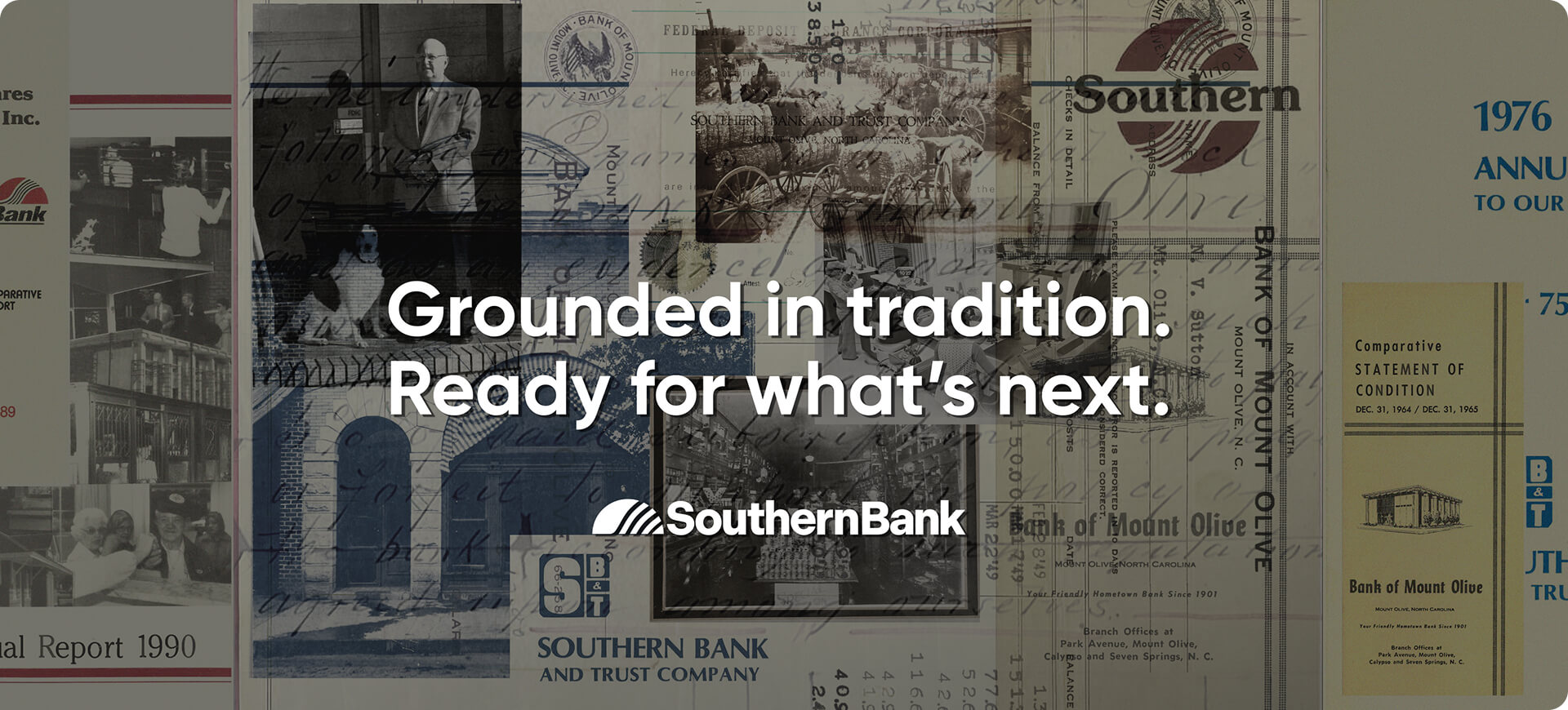
Southern Bank has been a fixture of its communities since 1901.
Across rural towns, mid-size markets, and metro areas spanning eastern North Carolina and southeastern Virginia, generations of customers had built their financial lives around it. Consumer banking, business banking, wealth management and mortgage all operated under the same name, each with its own customers, competitive set, and way of describing what it did.
That breadth was a strategic asset and a strategic problem at the same time. Southern had the range to serve customers across a full financial life. But the brand hadn’t kept up with what the institution had become, the media program was fragmented and unattributable, and the digital experience wasn’t built to acquire the next generation of customers.
So Southern went looking for a partner who could modernize a 125-year-old institution across brand, media, digital and community, without erasing what made it worth modernizing.
Transforming a 125-year-old institution is one of the most strategically precarious engagements in financial services.
Done wrong, it disrespects the customers who chose the institution because of what it had always been. Done too cautiously, it produces a slightly cleaner version of a program that already wasn’t compounding. And done piecemeal with brand here, media there, and digital whenever; it produces exactly the disconnection Southern was trying to escape.
The brand refresh had to set up a 125th anniversary campaign the following year and fit into a revamped media program seamlessly. The media program had to drive traffic to a digital experience being rebuilt underneath it.
Business banking in metros, consumer relationships in rural markets, wealth prospects in affluent beach towns, and retirees on the Outer Banks looking for different advice — not the same audience, not the same media market, not the same message. A program built for the average of those markets would fail across the footprint.
Southern couldn’t pause customer acquisition for a year while the brand and digital experience were rebuilt. Every phase had to produce results while the next phase was being laid.
Anniversaries are unforgiving deadlines. The refreshed brand, the activation plan, and the media program all had to be in market and working before the institution’s most visible year in a generation.
For 125 years, Southern’s customers had stayed because of the relationship; the recognition that someone at Southern knew their name, their business, their family, their plans. The problem wasn’t that the relationship wasn’t real. The problem was that the brand, the media, and the digital experience had all stopped explaining what the relationship now made possible.
The brand, refreshed
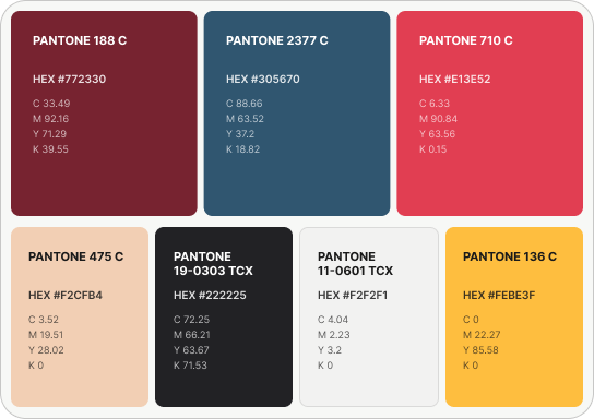
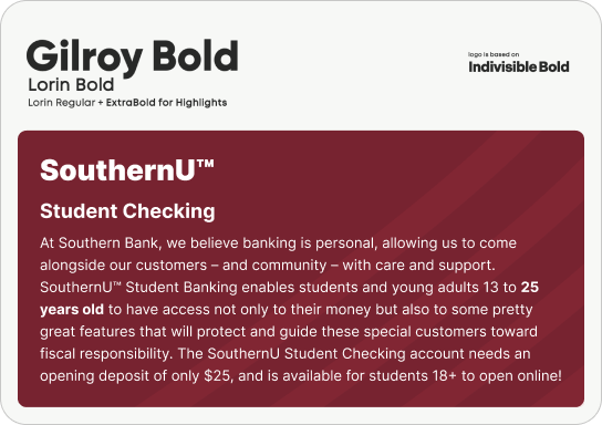
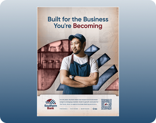
The refreshed Southern Bank identity preserved the institutional weight customers recognized: the arch, the wordmark, the palette rooted in Southern Bank Red and Southern Bank Blue. A full identity system followed: logo architecture across the master brand, Wealth Management, and BancShares; a defined voice (“assuring, dependable, and full of Southern hospitality); typography, elements, photography direction, and accessibility-governed color combinations, all codified in brand guidelines built to be used across the bank and its partners.
125 years as a launch vehicle
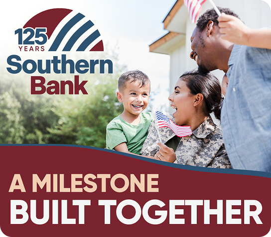
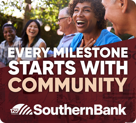
Most banks treat an anniversary as a birthday. We treated it as a strategy: the single best occasion a 125-year institution will ever have to reintroduce itself.
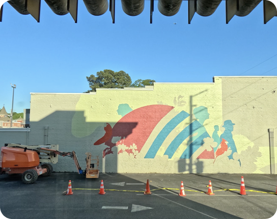
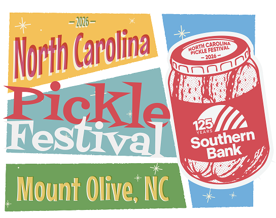
The year-long 125 activation plan spanned events, press, advertising, branch moments, and digital, including hometown activations and anniversary creative built for every channel from broadcast to :10 social video.


A media program rebuilt from the ground up
Underneath the campaign, we rebuilt Southern’s entire media program, moving it from fragmented, sporadic, and unattributable to targeted, data-driven, and audience-focused.
The architecture was a three-tier system built for the diversity of Southern’s footprint: a brand tier establishing the institution across all markets, an evergreen product tier promoting specific business and consumer products where market conditions justified them, and a market/local tier funding hyper-local presence. Media and digital work included OOH, local radio, sponsorships, and local SEO across the towns where community visibility is the whole game. Every tier carried explicit business/consumer splits and metro/small-town allocations, so a dollar in a metro market and a dollar in rural market were each doing the job that market actually required.
Beneath the allocations sat branch-level audience intelligence: mobile visitation data, demographic and psychographic segmentation, and media consumption profiles for every key branch market.
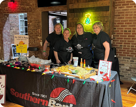
The local layer was rebuilt as true partnership, not spot buys: station sponsorships, business journal programs, community initiatives, and event presences across every market tier.
Community partnership as a growth channel
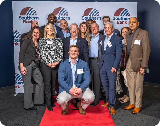
The Carolina Hurricanes partnership turned Southern’s community values into a performing media property. As part of “A Win for Kids,” Southern Bank donates $500 to the Carolina Hurricanes Foundation every time the Canes win, giving the brand a reason to show up in the state’s most passionate fan community with something to say beyond rates.
It also produced one of the engagement’s sharpest optimization stories: HIFI recommended running the campaign continuously through the season rather than only on game days. Conversions rose 124%.

The digital groundwork
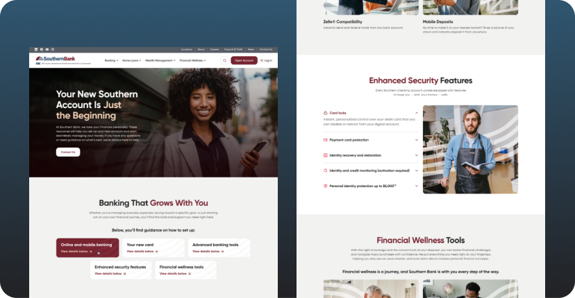
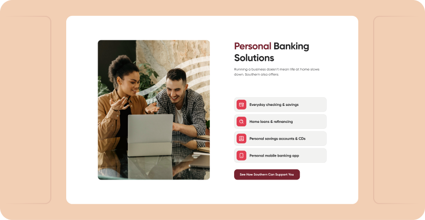
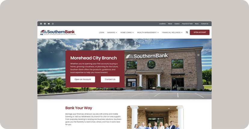
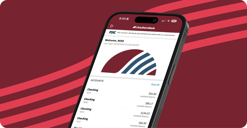
While the brand and media were in market, we were rebuilding key sections of Southern’s website in phases, modernizing the experiences that matter most for acquisition first, and laying the platform for the full digital experience transformation now scheduled through 2027.
Rebuilding the site all at once would have meant a year of dark work while paid media drove traffic to an experience that undercut the brand. Rebuilding it in phases meant every media dollar spent during the transformation landed on a progressively stronger experience, and by the time the full transformation ships, the brand, the media program, and the audience intelligence will already be pointed at it.
The lifecycle layer
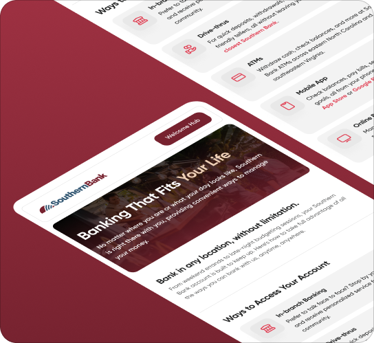
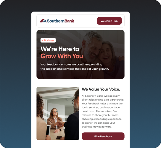
New customer acquisition only compounds if new customers stay. We built Southern’s email marketing programs from the ground up: onboarding journeys that welcome new customers into the relationship the brand promises, and nurture programs that introduce the capabilities most customers never knew their bank had.

With a refreshed brand and media across every inch of the footprint, the transformation is producing at every layer: brand, digital conversion, and community engagement.
Key conversion events including contacting bankers and starting applications.
Wealth website engagements, producing new leads for a growing wealth management team.
Impressions across five campaign pillars
New visits into a rebuilt digital experience

HIFI took the time to understand who we are as an institution and translated that into a rebrand that truly evokes our grounding in tradition while positioning us for what's next. What stood out most was how quickly and completely our leadership team got behind the vision.