-
Case study
Kiavi
A fintech lender’s brand, rebuilt around the system behind the deal.
Sector
Engagement
Year
Practices
Kiavi is one of the country’s leading capital providers for residential real estate investors.
By 2026, the brand had a problem most companies would envy: the product had outgrown the story.
The original value propositions had become table stakes; the category language every competitor now used. Meanwhile, Kiavi’s customer-facing technology had matured to the point where the platform advantage was real and demonstrable, but absent from the brand and its story.
Unlocking the system brand
Kiavi’s capabilities were more advanced than the way the brand explained them.
The work had to shift the language from loans, speed, and technology to the system behind the deal — without inventing claims the product couldn’t cash.
What once set Kiavi apart had become category language. The new position had to move to ground that’s harder to follow: confidence at the moment of decision, backed by Kiavi’s data.
Investors’ needs change deal to deal. The brand had to adapt across guidance, empowerment, and autonomy: one platform story that flexes, instead of fragmenting into product-by-product narratives.
Kiavi’s green and its mark carried real recognition. The system had to modernize the expression while keeping what the market already knows.
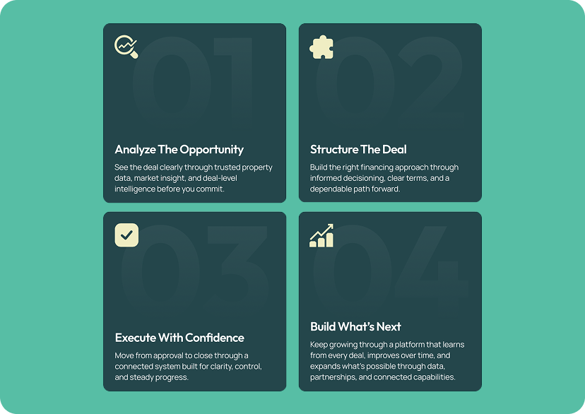
Kiavi didn’t change what it offers. It changed what those offerings add up to: one connected platform that helps investors evaluate opportunities, access capital, and move deals forward.
BRAND MESSAGING
One story, three layers
Any strong technology brand system has flexibility and layers. For Kiavi, that meant the Brand sets the story, the Platform defines the experience, the Products equip the investor.
BRAND VISUAL SYSTEM
Keep what the market knows. Sharpen how it performs.
The refreshed system anchors on a Grove that brings depth and trust; Patina carries Kiavi’s green equity forward in a more refined register; Turf adds momentum; Limestone brings warmth. Every pairing in the palette was tested against every other and documented in a full accessibility matrix — accessibility engineered in from the start, not checked at the end.
](https://hifiagency.com/wp-content/uploads/2026/09/brand-identity-visual-system-img-3.png "brand-identity-visual-system-img-3 | HIFI Agency | Financial Marketing Agency")

MOTION & MARKET EXPRESSION
A dynamic system for any channel, anywhere.
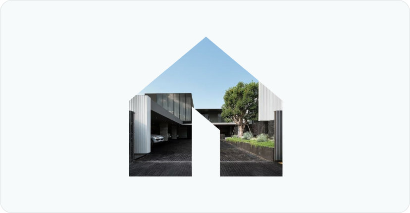
The primary logo animation constructs the symbol through the Data Flow pattern over a structural grid, then recedes to a clean resolve: the platform thesis compressed to three seconds.
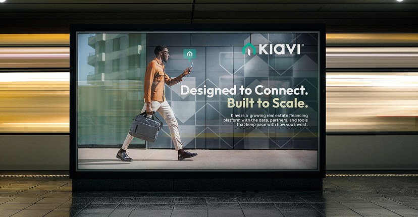
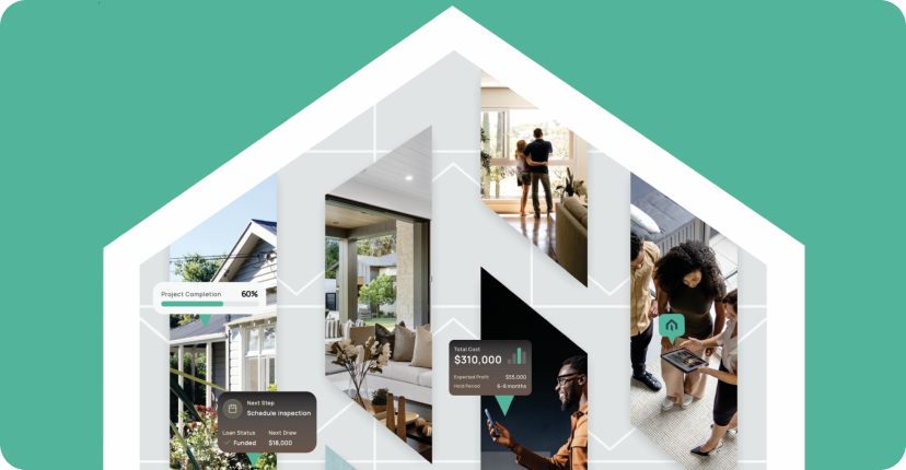
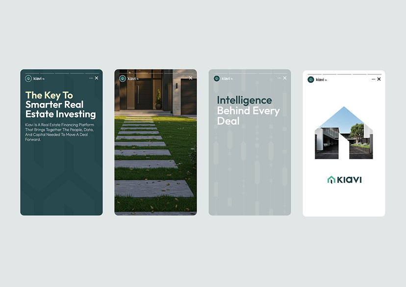
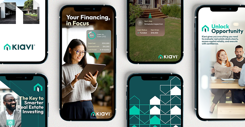
In market, the photo overlay system makes the platform’s intelligence visible — deal-level data rendered as brand expression, integrated into photography, never decoration. The same system carries display, social, out-of-home, trade, portal, and homepage guidance without fragmenting.